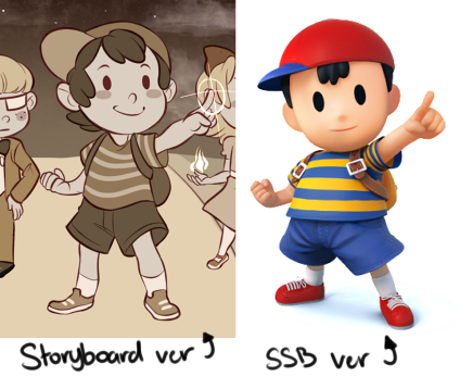
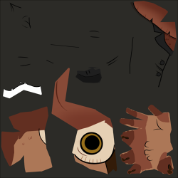
During our Rapid Production project, I contributed to the team as an art director, and basically ensured that the style is kept appealing and consistent throughout the animation. We had a tight time constraint on the project, which evoked a lot of stress and pressure on everybody, though we still managed to pull through and work together as positive team players. I particularly enjoyed my job, and had a lot of fun throwing together storyboards. I showed my team two [main] sources of inspiration I had in mind while evaluating how the characters should appear in the teaser trailer. One of them being Super Smash Bros Ness, and an indie game developer’s reboot of Ninten from Mother 1.
My team expressed that they liked the style ideas, and ultimately decided to run with it! Art production was a breeze since we were constantly keeping everyone updated in the chat, while also sharing our progress. I didn’t feel the need to exchange criticism for the most part, since me and the art team did a surprisingly fantastic job at maintaining the style we worked objectively towards. Our collaborating skills were successful when it came to how the textures turned out.
This slideshow requires JavaScript.
I’m really satisfied with how the texturing has come together by everyone, as we all managed to collaborate and reproduce a style inspired by only two sources. I’ve got nothing negative to say about it, honestly.
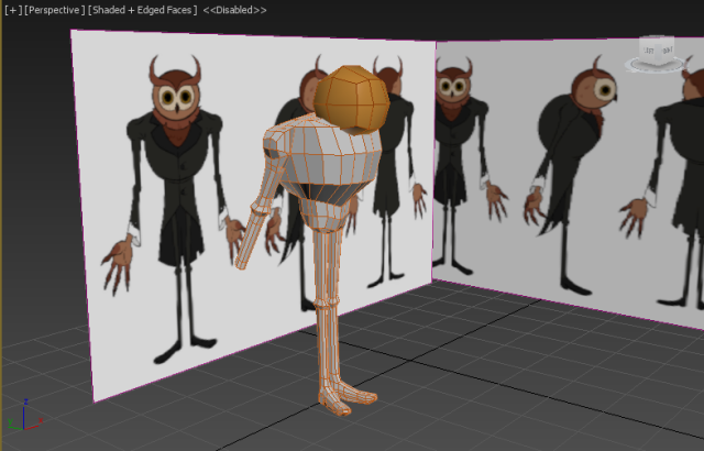
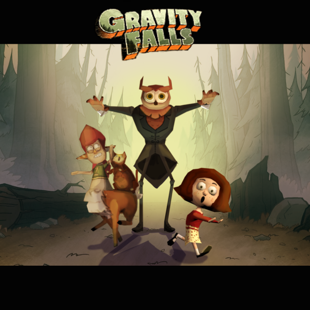
Another example of collaborating with creative concepts, is during the Character Design project. Like I’ve mentioned in a previous post, me and my team settled with Gravity Falls. The first thing we aimed for when designing our characters, was that we needed to avoid creating too many humans. This is mostly all due to the fact that the humans within the show have very distinct faces, there’s a lot of repeating facial traits, and there just wasn’t enough to work with. We have mainly monster characters, at least then we’d have more free creative expression. I optimized the criticism I received in the first couple weeks of production, and altered my Owlman according to my team and studio tutors’ feedback. You can read these posts [1, 2] for a deeper explanation to the steps I took to improving my Owlman. But essentially he went from looking like Stan Pines, to the Summerween Trickster later on, developing into a more eerie antagonistic character.
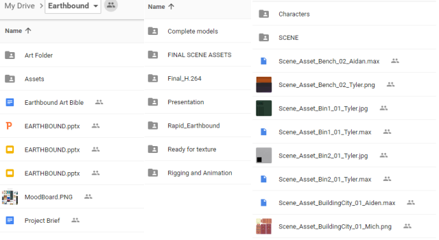
When it came to the functionality of our projects, we heavily depended on the use of easily accessible frameworks. This proved to be successful, while unsuccessful in some. An ineffective one was our Rapid Production frameworks. In the beginning, we hardly experienced problems with our workflow and the way the documentation was handled was still easy to access. We already established a proper file naming system, while also placing files in their desired folder. Pre-production was the smoothest stage as one will expect.
It was when we reached production when our file management structure begun collapsing. The team’s organizer pointed this out first, claiming it was a nightmare to find the 3ds max scenes he needed in our production frameworks. Looking back at our folders, he is right. It’s absolutely horrendous.
The above doesn’t even show the complete mess that is our technical framework arrangement. There were A LOT of unnecessary files and folders, and in the end, it became a maze just to find the files for our final teaser animation.
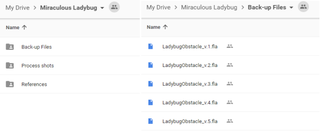
Fortunately, in our newest project [the obstacle course], me and TK have created a collaborative framework structure that works best for us. It’s far more straightforward and clean in comparison to the frameworks I had during Rapid. Naming conventions are being taken into consideration, and we always have external devices to for back-up purposes as well.
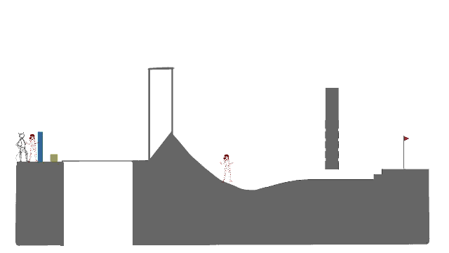
A couple of weeks ago, we were given our new assessment, which you can tell by the title is the Obstacle course. We had to choose an already existing character, and animate them making their way from point A in the obstacle course, to point B. While also staying true to the character’s signature movements and attitude. I partnered up with TK on this one, and together we settled with Ladybug and Chat Noir from the show Miraculous Ladybug.
I chose Ladybug out of the two, and me being quite the shameless, passionate fan I am, I already had an idea as to how she would move throughout the course. Of course, I still did my character studies, and discovered the differences between Ladybug and Chat Noir when it solely comes down to their actions. Chat Noir is comical, undoubtedly expressive in both movement and speech, and characteristically feline-like. Ladybug in comparison, is graceful and isn’t as standoff-ish as Chat. She’s fluid, agile, and noticeably acrobatic in some of her poses.
The reference I used to key out Ladybug’s movements: [LINK]
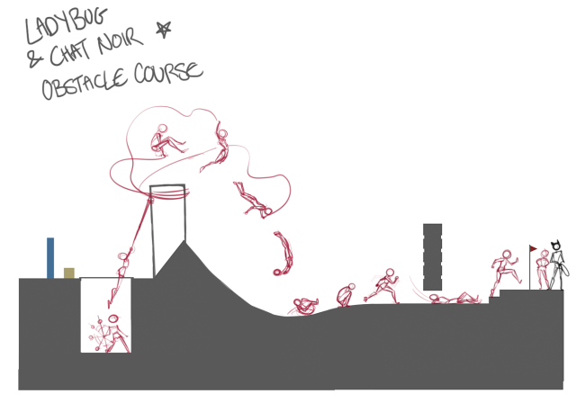
This is the first obstacle rough outline I did. Initially, me and TK decided we should have Ladybug begin at the bottom of the pit, enabling her to propel herself over the tower without the risk of face-planting against it. Then afterwards, have her slide under the floating wall, and dash up the stairs to pull on Chat’s tail before he careens over the edge. But after we received feedback, we were advised to alter our plans. For Ladybug, she needed to begin at the starting point, and have her interact with Chat Noir more so the viewers can establish the kind of relationship they share. Her landing poses needed to be revised too.
So me and TK went back to the drawing board and begun sketching more roughs to the altered obstacle course:
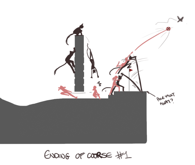
The above obviously isn’t complete, but we have a good idea for the direction of the animation. Now we have Ladybug and Chat Noir walking onwards together until they reach the pole/tight rope(?), where Chat disconnects from their stride to walk ahead of Ladybug, showing off his “guns” to her. They’re both fairly distracted, until their attention is grabbed by the arrival of an akuma. Chat loses his balance and falls from shock, evoking Ladybug to quickly spiral her yo-yo and fasten it around the building opposite. She dives in to catch Chat, pulling him back onto the surface, where she proceeds to propel herself over the building. She and Chat make contact again after he joins her on the other side of the building, then they continue dashing forward. Chat climbs up the floating wall, Ladybug slides under it. The two end up clashing into eachother, before pole-vaulting away. Like so:
The following week, we were given more feedback. A couple of the things that were pointed out about these new changes, is the fact that our staging was lacking; there were too many actions happening all at once. Ladybug’s propel and landing was also weirdly timed. She is too fast on the ascension, and too slow on the descend. I was conjointly advised to have her propel OVER the building, instead of through it. So me and TK had to reconsider the placement of the characters, as well as the timing.
Here’s what our animation looks like so far. We fixed the timing and the placement of the characters. I have to revise her landing (again) to have it contact the ground better. I aim to have all my key frames and breakdowns completed before the end of this week!
Before we undergone the camera test, I had little to no experience with handling cameras. So every aspect of this learning experience was all new to me. Starting off, our instructor guided us through setting up our camera. Which was the basic battery, SD card, and lens installation. Then afterwards we were walked through changing the exposure, ISO, shutter speed, and aperture to achieve specific outputs. It wasn’t difficult to follow along, our instructor was very engaging and answered any inquiries we had.
I experimented a little with the different lenses, such as using the long-focus lens before the default one. The exposure compensation helped with brightening an image with or without the flash if it doesn’t come out as desired. The ISO is essentially the setting for light sensitivity, so the higher it is, the more sensitive it is when picking up light. The shutter speed is the length of time where the digital sensor in the camera is exposed to light. If the shutter speed is slow, the still and sharper it looks. The faster it is, the better it captures the light and the motion of an object. While the aperture shows the depth of the field within a photograph, such as blurring the background, or magically bringing everything into focus. (I’m noting down all these functions for myself so I don’t forget lmao).
One common, yet interesting camera effect I remember learning about is the Fisheye effect, which uses a long-focus lens to produce a distorted image with an extreme angle of view. It apparently works best while being partially metered away when using circular Fisheye, without scratching the bulbous front element.
It was all a matter of remembering where all the camera functions were positioned. I had a little trouble recalling where specific buttons were placed before the test, but our instructor was very understanding and walked me through it some more. Now that I know the basic elements to controlling a camera and setting up a tripod, I’m interested in using the DSLR cameras for animation references. This was definitely related to my line of work, and will sure benefit me heaps in future projects.
I have been absolutely terrible with keeping this blog updated with what’s been happening in studio, so let’s get this show on the road.
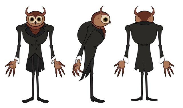
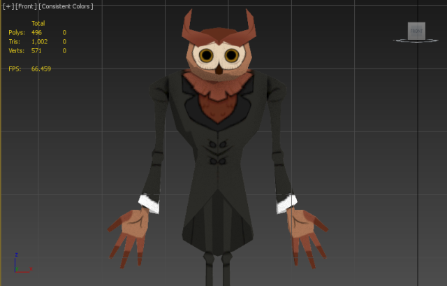
Since my last update on the Character Design project, I’ve made a small modification to the Owlman’s design. While I received mostly warm feedback (not intending to brag), Chris suggested accentuating one of the Owlman’s features, to draw focus primarily towards his already abnormal face. During our week 4 feedback session, both Chris and TK (one of my team members) suggested exaggerating the Owlman’s brow feathers, making them appear more horn-like. We decided afterwards to make the Owlman appear as the antagonist in the line-up, so it made sense why he’s developed into a more eerie, intimidating kind of character. Here’s my finished character sheet:
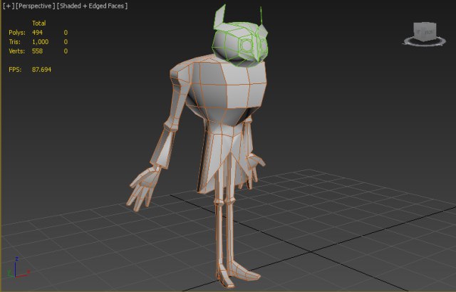
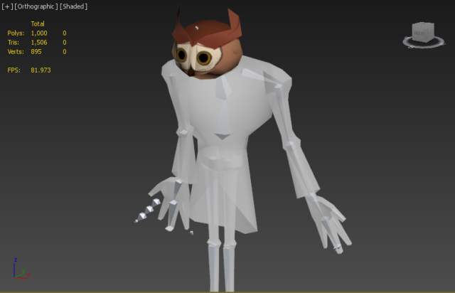
Right afterwards, I begun blocking out his body in max. Which admittedly, isn’t my strongest point. I’ve never completed a 3D model prior to this project, let alone have I ever modeled a character’s body without some form of real-life assistance.So modelling the Owlman was both a struggle and a learning experience. What I did was begin with the abdomen using a box, dragged the vertices to align with the character references, and extruded faces to gradually mold his torso together.
One of the mistakes I immediately made while modelling him was surpassing the limited tri/poly count. I knew we had to ensure the model was low-poly, but I didn’t read the complete brief, where it informed us we were only allowed up to 1000 tris/polys (good work, me). I had to sacrifice a lot of tris/polys to my dismay.
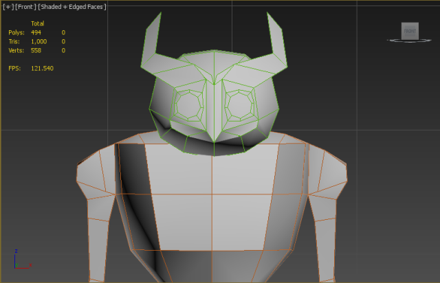
As you can see, there’s practically a field of edge loops where they’re not necessary. After receiving help from my group and Chris, I managed to render the model down to only its most crucial tris/polys. I implemented edge loops only to the most appropriate areas in my Owlman model to allow acceptable deformity, while now also taking the tri/polycount limits into consideration. In addition to this, I begun modelling his head. It was unbelievably difficult to get the vertices to align in the way I wanted them to. Unfortunately, I forgot to screen-cap my first attempt at modelling the Owlman’s head, so to put it simply, it was a cluster of discombobulated polys which didn’t mold the face well at all.
So I referenced this video when progressing through the head stage:
This speed-process video was done through Blender, but it still proved to be of use while modelling the Owlman’s head. As always, I started with a box, added a spherify and symmetry modifier to it, made two big intrusions in the eye area, added extra edges, and edited the geometry to give them a rounded look! Lastly, I extruded the polys inbetween the eyes to shape them into his lil beak.
I referenced these specific tutorials when constructing the body:
I followed The 3D Tutor‘s methods on constructing the torso, arms, and then moving onto connecting the legs. It helped A TON, granted this is my first time modelling something without having someone in-person assisting me. This person’s tutorials were very informative, and demonstrated an efficient way to quickly block out a low poly body for a model. Following his method, I started with a singular box, positioned it underneath Owlman’s supposed “peck” area, dragged the vertices to the flow lines that flow over the model, to avoiding harsh angles. I then proceeded to extrude from the faces of the box, and position them according to the Owlman’s ref sheet. The main reason why I value this method so much, is that I was able to keep track of my tri/poly count this way. By starting with a singular box and gradually building on from it, it eased my workflow and made my model more visually appealing.
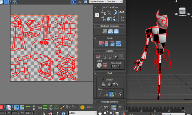
Moving on, once I was satisfied with the model, unwrapping followed straight after as expected. Unwrapping was another grey area for me, and although I looked up several tutorials for it (including the Mage tutorial), it was still troublesome to walk through. Eventually one of my teammates stepped in and helped, and they caught me up to speed with the process. By then, I had even less time to complete the model because we aimed to have everything up and rigged a day before the presentation. There was no time to be fussy with my UVs, essentially.
I’ve still got a long way to go before I’m confident with my unwrapping. Working on this was a wake-up call for me to study the unwrap process, I’d love to get it done without always remaining dependent on the help from others in future.
Up next was texturing! Which is the stage that I enjoy the most in the pipeline, granted I’m rather comfortable with my 2D painting. I switch between Photoshop and Paint Tool SAI constantly when texturing, as I do most of my texturing on SAI, then touch-ups later on Photoshop. The canvas size was initially 2500×2500 before I re-sized it to 256×256, to give me more leeway for painting. My UV coordinates inevitably became a problem after I began texturing, as some areas in the texture map were far too stretched and appeared pixelated on 3Ds Max. A problem solving method that worked best for me was to utilize smaller, sharper brushes to paint on the stretched UVs, while also using bolder, black lines when outlining the the clothes folds and other creases. All the while, staying within the Gravity Falls style.
A way I used textures to define surface properties, was to first research further into the surface defining aspects of the Gravity Falls’ art style. Because it’s a simplistic style—using only minimal lines to define texture—I focused fundamentally on crucial lines to emphasize the Owlman’s features. For example, I added squiggly “w”s to give the illusion of feathers, and shaded beneath the feather layers around his neck to give it depth.
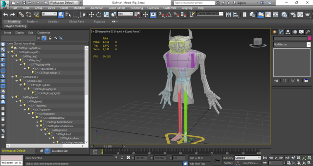
I was originally advised from a peer that I should settle with a bone system when rigging the model, instead of a CAT rig. Once again, I followed a tutorial when going about the bones, and while I managed to execute it the way I was taught in the tutorial, I had little to no knowledge when it comes to using bones.
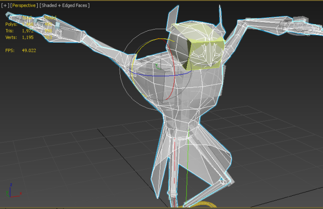
It looked dodgy as hell to me too, and with the amount of time we had left, I left the bone system and tried the CAT rig. I received help from another peer when constructing the rig, as I only ever rigged a model once prior to this project. This said-peer introduced me to an interesting way of applying the rig, and that was to manually add the limbs yourself, besides pasting and positioning the full rig. Which I found helpful, as I was able to pick and choose where each limb went, while leaving out the unneeded parts of the rig. I ended up with something like this.
The skinning process wasn’t as nightmarish as I anticipated, though it was a long and tedious one. My Owlman’s pose wasn’t too extreme in comparison to the others’, so I think I saved myself with this one. I begun by assigning all the vertices to the appropriate limbs to get that step out of the way. Then as it came to posing, the shoulders, ends of the coat, and arms glitched on 3ds max. There was plenty of deformity harboring those areas. But I handled these issues fairly well, with the help of Tyler and Aidan (bless you two). So I didn’t stress about it as much as I could’ve! The rest of the process was basically me aligning the vertices properly and making them presentable for final renders.
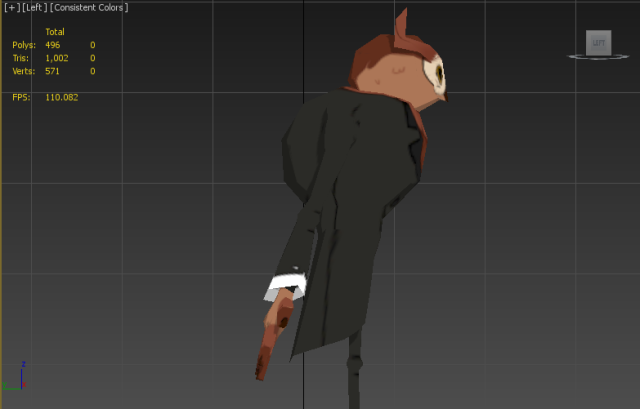
Here’s the final render! Which was edited by the lovely TK. Unfortunately, one of our group members wasn’t here the day we were putting this together, so our finished product is lacking one character. All in all, I’m very pleased with how mine and everyone else’s models turned out. Working on this project has been quite an eye opener for me, as I was finally engaging in something that is far out of my comfort zone. This is my first ever 3D model, and I’m pretty satisfied with the end results.